Toric Onboarding
From friction to flow: Slashing onboarding time by 40% and boosting user success
Overview
As the lead UX designer at Toric (currently Datagrid), I reimagined how new users interact with a powerful data analytics platform. The original onboarding relied on white-glove support and complex workflows that limited scale. My challenge was to design a self-serve experience that would make complex data import and transformation workflows intuitive, even for non-technical users.
By combining user research, prototyping, and cross-functional collaboration, I led an onboarding redesign that reduced onboarding time by 40%, enabled self-service free trials, and improved data import speed by 65%.
Goal
Reduce time-to-value for new users.
Enable self-serve onboarding without requiring sales or support assistance.
Provide clear guidance for getting started with Toric.
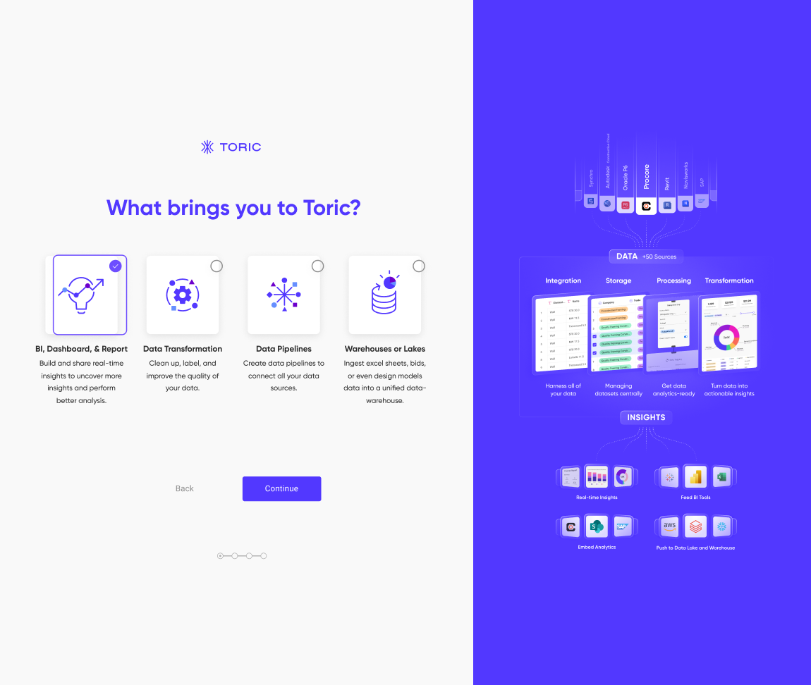
Personalize the onboarding experience based on user goals and data types.
My Role
Lead UX Designer & Content Designer
Partnered with one additional UX designer and two developers
Tools: Figma, Miro, UserTesting
Timeline: 12 weeks (Sept – Nov 2022)
The Challenge
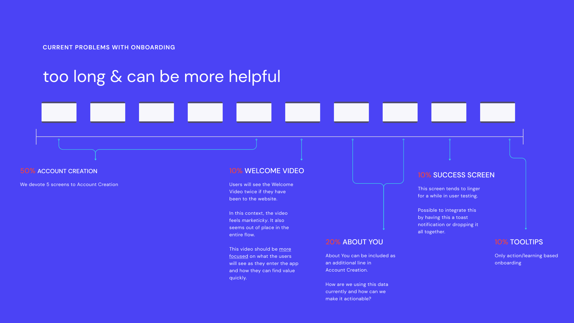
Toric’s onboarding process was originally designed for enterprise, high-touch clients. While effective for small cohorts, this approach limited the company’s ability to scale through free trials. The process included:
8+ onboarding screens before users reached any value.
A redundant welcome video that felt out of context.
Chatbots that interrupted the user flow.
Limited personalization for data types or user goals.
User feedback made the problem clear: the experience was too long and not actionable enough.
Research & Discovery
Our goal was to transform Toric from a white-glove setup into a seamless, self-serve trial experience.
We audited the existing flow, analyzed drop-off points, and conducted targeted user interviews with early adopters.
Key Insights:
Users found the onboarding video repetitive and unrelated to their goals.
Many preferred having templates or pre-populated data to start quickly.
Contextual guidance (not chatbots) was more effective for navigating complexity.
These findings shaped our hypothesis: personalization + guided setup = faster activation.

Wireframes & Early Design
I translated insights into wireframes using Figma, focusing on minimizing cognitive load and guiding users through meaningful actions.
Working closely with the brand and product teams, we:
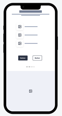
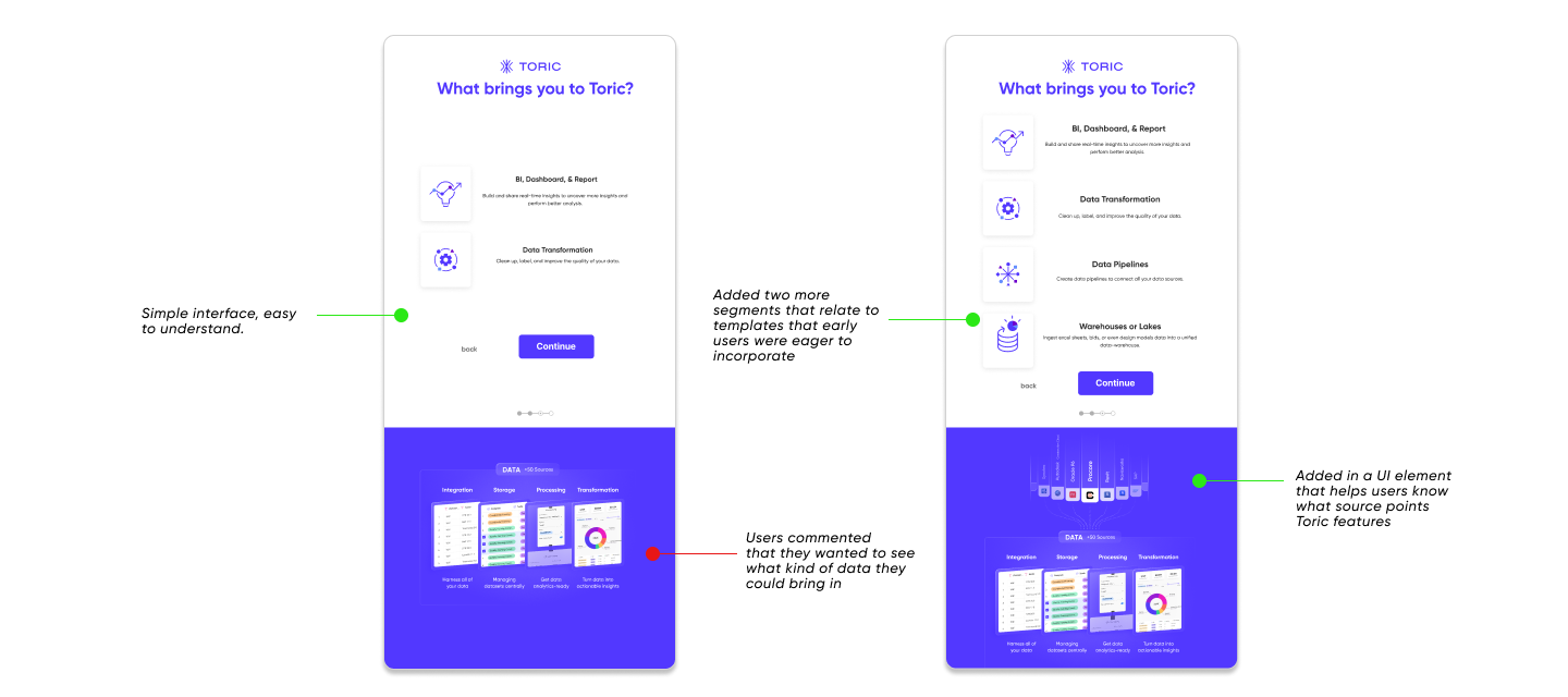
Streamlined the number of screens from eight to four
Added branching logic so users could select their main goal (“import data,” “analyze trends,” etc.)
Introduced modular components that reflected the platform’s new visual identity system
At this stage, we conducted four moderated usability tests to validate flow and clarity before moving to high fidelity.
Usability Testing
We created a fully functional prototype and ran additional usability tests with new participants to verify improvements.
Key Insight 1:
Users wanted data pre-populated into the app.
Participants leaned into templates and wanted their first interaction to feel personalized.
Design Response:
We introduced dynamic templates that automatically populated based on user-selected data sources. This required collaboration with developers to map data structures to template logic.
Key Insight 2:
Chatbots disrupted the user flow.
Users described the chatbot as “annoying” or “jumping out too soon.”
Design Response:
We replaced the chatbot with contextual tooltips triggered by user behavior — offering guidance only when needed.
Key Insight 3:
Onboarding felt long and disjointed.
Design Response:
We reduced the flow to four focused screens and integrated the success message into the final setup screen, eliminating unnecessary steps.
Final Design
Once usability issues were resolved, I moved on to final designs in Figma, aligning with Toric’s evolving visual identity system. The new flow featured:
Streamlined onboarding with clear progress indicators
Personalized templates that loaded real data
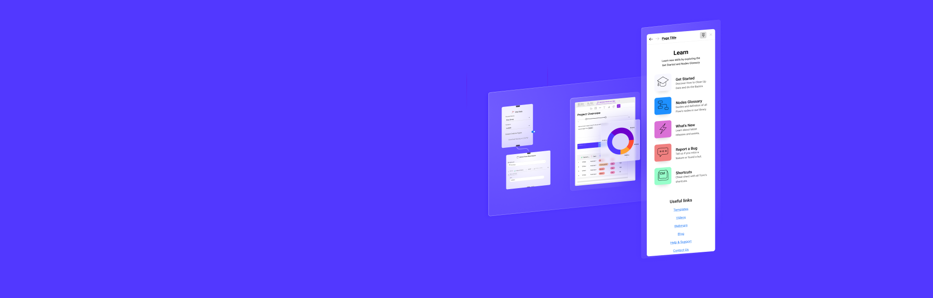
Subtle tooltips for contextual support
Updated success screen with next-step recommendations
Impact
The redesign delivered immediate, measurable results:
65% faster data import and transformation
17% reduction in churn
60% of users successfully self-onboarded without sales assistance
Support tickets decreased by 50%
Learnings
Onboarding isn’t a one-time task… It’s a living system that evolves in response to user needs.
Through this project, I learned how early activation moments drive long-term engagement, and how small details (like pre-populated templates or tooltip timing) can significantly shape user confidence.
This project deepened my understanding of how early user experiences can shape confidence, trust, and long-term engagement.
Next Steps
Following the onboarding sprint, our team identified adjacent opportunities to improve the in-app design experience for returning users. This included contextual education moments and more granular personalization based on user behavior.
The onboarding framework we built continues to serve as a template for adopting new features across Toric’s product suite.